Overview
Spring '26 is arguably the biggest Flow update in recent memory. Screen Flows get a native style editor, a Kanban Board component, and editable Data Tables. Flow Builder's canvas finally supports mouse-wheel scrolling and collapsible branches. Debugging no longer means re-entering every variable after each edit—values now persist across runs. Flow Logs write execution metrics directly to Data 360, freeing admins from the 2 MB Debug Log ceiling. And Agentforce has landed inside Flow Builder itself, letting you describe business logic in plain English and have AI build the flow.
This article breaks down these updates across four dimensions: Screen Flow component upgrades, canvas experience improvements, debugging and monitoring, and expanded capabilities.
Screen Flow Component Upgrades
Screen Styling: Native at Last
Changing a button color in a Screen Flow used to mean building a custom LWC or resorting to CSS override hacks. Spring '26 adds a Style tab to the Screen element's properties panel, supporting direct customization of:
- Container Style: background color, border color, border weight, border radius
- Header Style: text color, font size
- Footer Style: separate settings for Next/Finish, Previous, and Pause buttons—including Default, Hover, and Active states
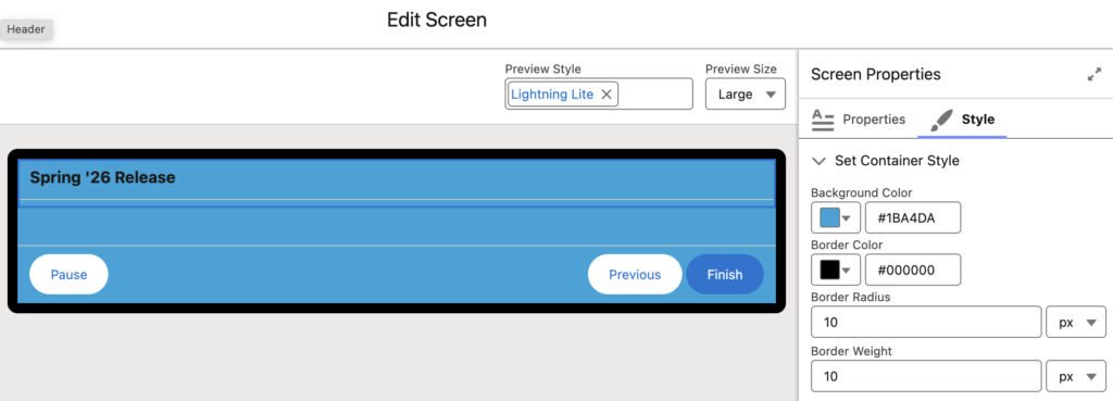
Here's what the Style tab looks like in practice. In the Screen element's Edit Screen view, the right-side properties panel now has a Style tab. The Set Container Style section lets you enter hex values for Background Color and Border Color, plus pixel values for Border Radius and Border Weight. The canvas on the left previews changes in real time—this example sets the container background to blue (#1BA4DA) with a black border, 10px radius, and 10px border weight, with Pause, Previous, and Finish buttons styled at the bottom.
Component-level styling is also available. Text, Number, Date, and Date/Time input components can each have their own background color, border color, text color, and focus-state color. Complex components like Email, Phone, and Address aren't supported yet, and label styling still follows the applied theme—no override available.
One practical limitation: color and size values must be static. Variables and formulas aren't supported. If you need conditional color changes, you'll still need to use Component Visibility with multiple differently-styled components.
Message Component: Native Alerts in Screen Flows
Screen Flows often need to tell users "that value is wrong" or "operation successful." Previously, this meant cobbling together a Display Text component with manual formatting. The new Message component ships with four types—Info, Success, Warning, and Error—each with its own icon and color scheme applied automatically.
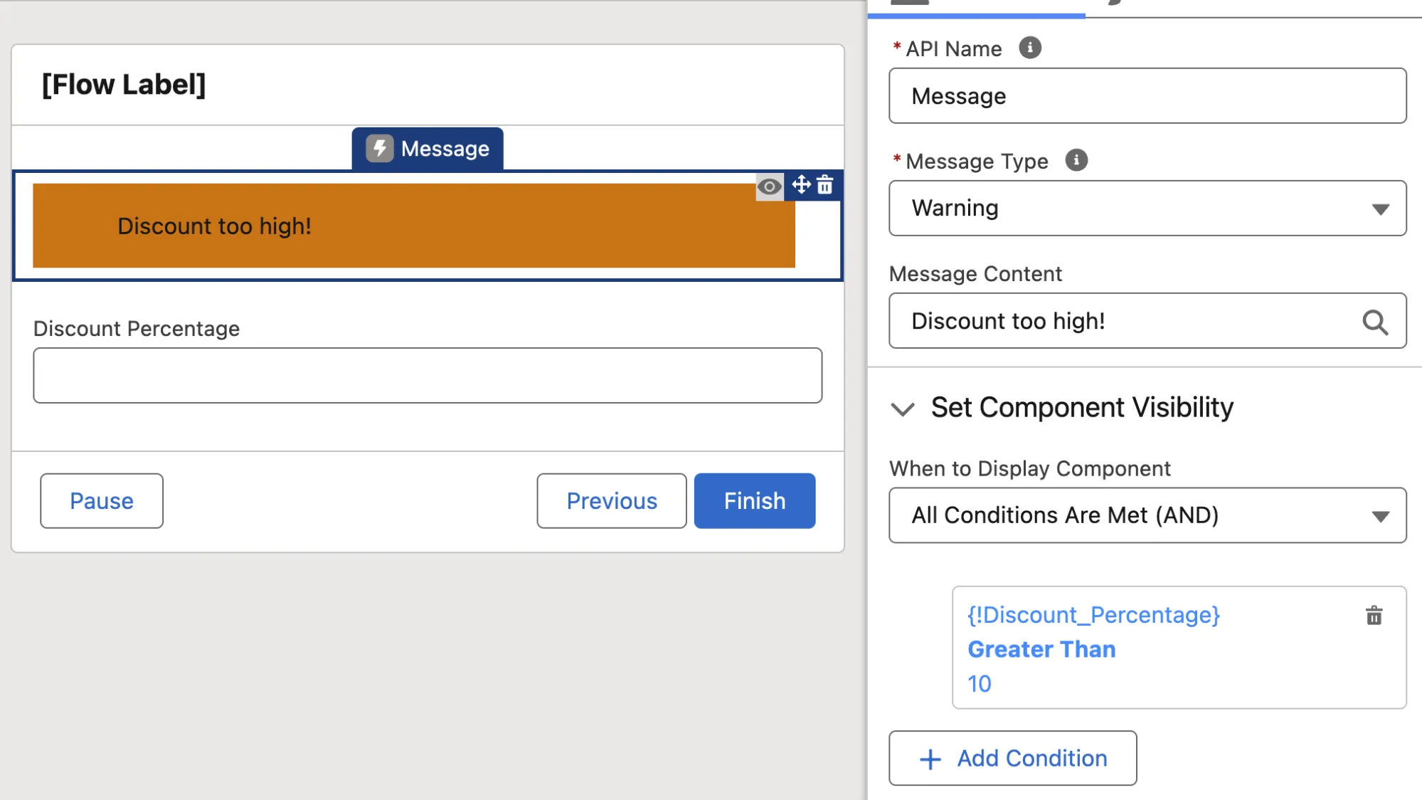
Paired with Component Visibility, a typical use case: show a Warning-type "Discount too high!" message when Discount_Percentage exceeds 10. The right-side properties panel handles Message Type and trigger conditions—no formulas required.
Kanban Board Component: Visual Management Inside Flows
The Kanban Board is a new native Screen Flow component that displays record collections in a board layout. It groups records into columns by a picklist field (like Status or Stage), shows up to 5 fields per card, and can aggregate number or currency fields per column.
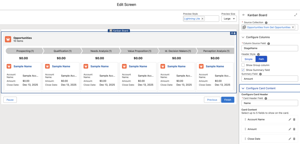
The Kanban Board arranges records into status-based columns with summary counts. The right-side configuration panel lets you set the Source Collection, Column Source Field (e.g., StageName), Header Style (Simple or Path), and up to 5 fields to display on each card. The current version is read-only—users can't drag cards between stages. That capability is expected in a future release.
Good fit for: embedding an approval queue overview, opportunity stage board, or task assignment view inside a Screen Flow. For read-only "glance at the distribution" needs, this component works out of the box and eliminates the cost of building a custom LWC.
Editable Data Table
This might be the most requested Screen Flow feature ever. The standard Data Table component was view-and-select only—inline editing required third-party components like UnofficialSF's Datatable. Spring '26 finally adds column-level edit toggles to the native Data Table.
The Data Table component's properties panel now includes a "Let Users Modify Data Table" section. Check "Edit column values" to enable inline editing, and each column can be individually configured for sorting and editing. At runtime, clicking a cell opens an inline editor with confirm/cancel buttons—the same interaction pattern as Lightning record page inline editing.
Supported field types for editing: Text, Email, Checkbox, Phone, Number, Percent, and Currency. Picklist and relationship fields (Lookup / Master-Detail) aren't supported yet—so no inline Owner changes or Status dropdown edits. Salesforce will likely address this in a future release.
How do you capture the edited data? When referencing the Data Table's output in an Update Records element, you'll see a new Edited Rows collection—it contains only the rows the user actually modified, not the entire table. Using this collection with Update Records is far more efficient than iterating through the full dataset.
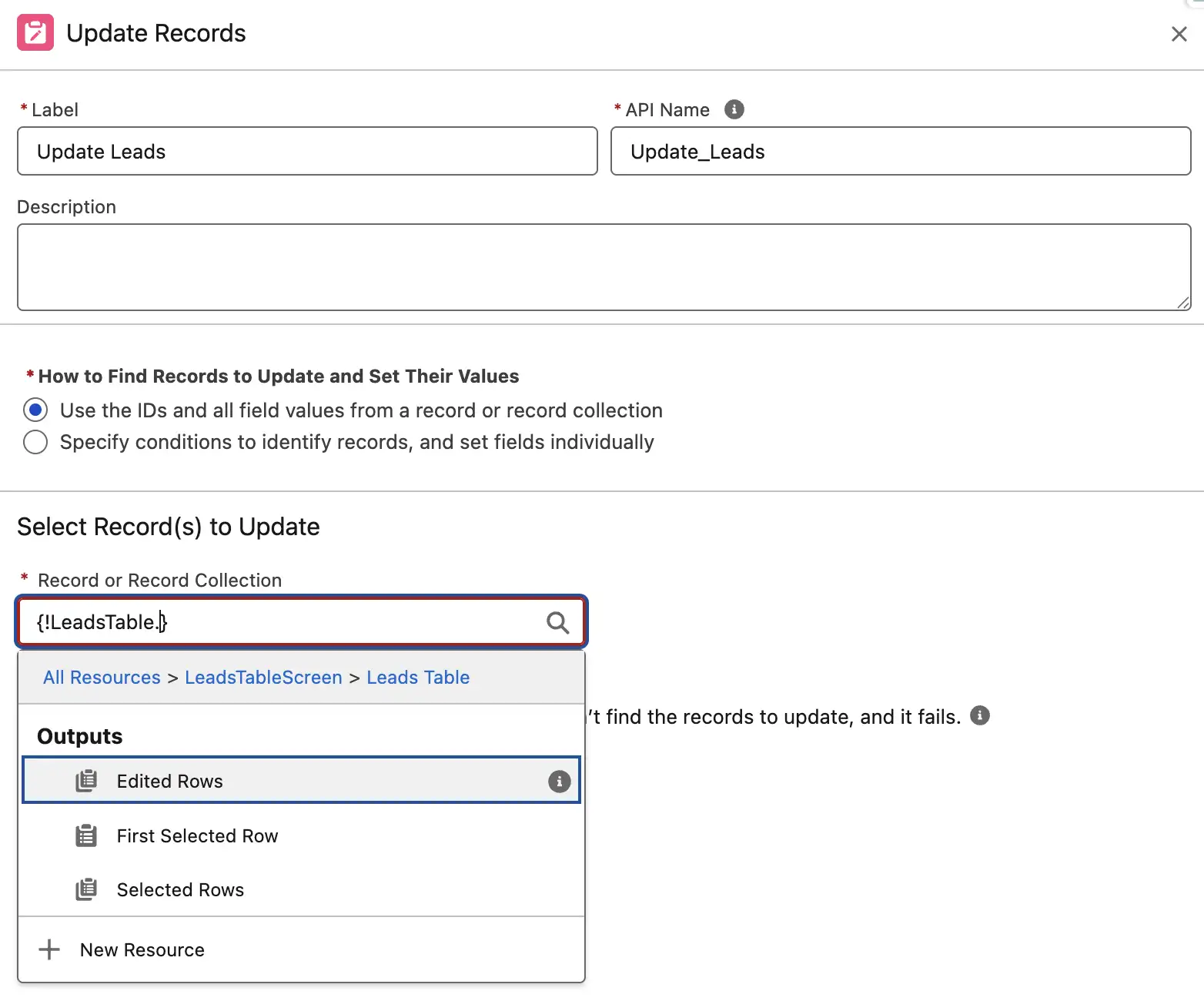
Technical detail: the Flow must use API v66 (Spring '26). Versions v65 and below won't work.
Canvas Experience Improvements
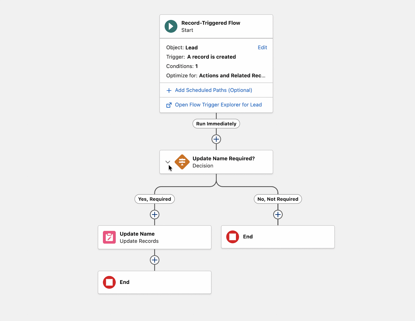
Collapsible Decisions and Loops
In complex Flows, expanded Decision and Loop elements eat up huge amounts of canvas real estate. Locating specific logic in a 50-element Flow was a nightmare. Spring '26 lets you collapse Decision and Loop branches, and the collapsed state persists within your editing session.
Note the new collapse chevron on the left side of Decision elements—clicking it collapses the entire branch into a single line, instantly reclaiming canvas space. When maintaining those "monster Flows inherited from the previous admin," collapsing irrelevant branches keeps things manageable.
Mouse-Wheel Scrolling
Navigating the Flow Builder canvas used to mean dragging blank areas or installing a third-party Chrome extension. Spring '26 adds native support for mouse-wheel scrolling, trackpad gestures, keyboard arrow keys, and Ctrl/Cmd +/- zoom.
Decision Element Logic Labels
The Decision element's logic options have been relabeled to "Define Manually (Default)" and "Define with AI (Advanced)." The AI option uses natural language to describe evaluation criteria and lets AI dynamically assess conditions—useful for unstructured data scenarios. Salesforce explicitly marks it as Advanced, recommending manual definitions for structured conditions.
Debugging and Monitoring
Persistent Debug Variables
The old debugging workflow: run Debug → find a bug → edit the Flow → run Debug again → re-enter every single input variable. Spring '26 persists debug input values within your editing session, so when you re-run Debug after making changes, your previous values are still there.
For Flows with many input variables (like Screen Flows with various parameters), this eliminates a significant amount of repetitive work.
Version-Specific Flow Tests and Version Comparison
Flow Tests can now be assigned to specific versions. When upgrading a Flow, old-version tests stay intact while you build new tests for the updated version—no risk of breaking legacy tests when modifying the new version.
Version Comparison is also new: select any two versions and the system displays differences in properties, resources, and elements. Comparison results can be shared with colleagues via direct link.
Flow Logs: Execution Metrics in Data 360
The Automation Lightning App now has a Flow Logs tab. Once enabled, Flow execution metrics—start time, completion time, duration, success/failure status, error details—are automatically persisted to Data 360 (formerly Data Cloud). You can analyze run trends, performance bottlenecks, and error patterns at the individual Flow level.
The Flow Logs tab centralizes logging management: enable/disable status, configured Flow list, and credit consumption guidance. The Resources section on the right links directly to Data 360 setup, the Rate Sheet, and credit consumption documentation—check your Data 360 credit balance before enabling.
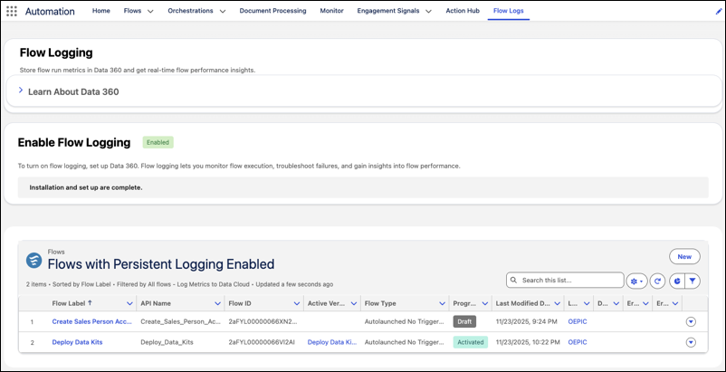
A critical caveat: Flow Logging consumes Data 360 Credits, so don't enable it across the board. The recommended approach is to enable it only for business-critical Flows (approval processes, integration triggers) and skip low-frequency or test Flows.
Enhanced Approval Flow Debugging
Testing a multi-stage approval process used to be a major time sink: trigger the Flow → manually approve stage one → approve stage two → finally reach the stage-three logic you actually want to test. Spring '26 introduces Start Point / End Point controls that let you skip preceding stages and debug directly from your target stage.
Even more practical: when the debugger reaches an approval step, you can approve or reject right inside Flow Builder's Debug interface without switching context. The Configure Test Output panel lets you selectively skip specific steps and substitute mock data for their outputs.
Expanded Capabilities
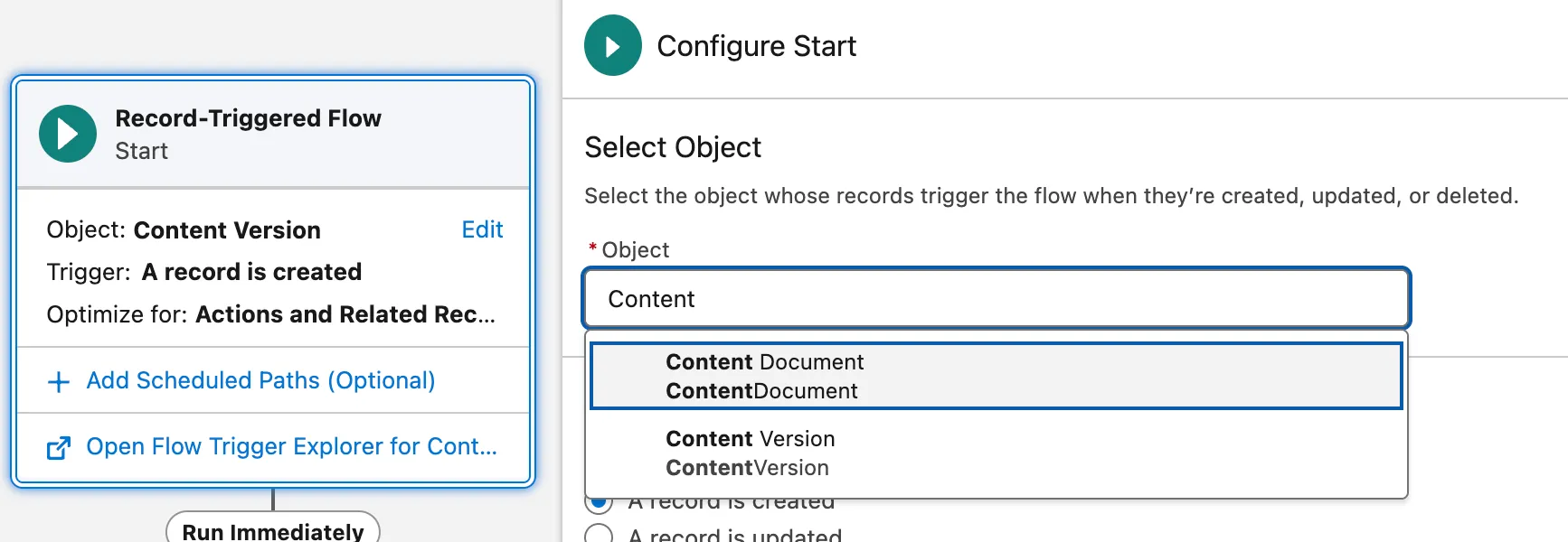
Content Document / Content Version Triggers
Record-Triggered Flows now support Content Document and Content Version objects. File uploads and version updates can finally trigger Flow automation directly.
When creating a Record-Triggered Flow, search "Content" in the Object picker to find Content Document and Content Version. Typical use cases: auto-tagging uploaded files, notifying stakeholders, or triggering compliance checks on new documents.
Request Approval Component
Launching an approval process from a Lightning page used to require custom buttons with URL hacks or Quick Actions. Spring '26 provides a drag-and-drop Request Approval component for Lightning pages and Experience Cloud record pages. Users can select the first approver, add submission comments, and kick off the process in one click.
Technical requirement: the component needs an underlying Autolaunched Flow with firstApprover and submissionComments input variables.
Agentforce for Flow: Build with Natural Language
Flow Builder now features an Agentforce panel (Flow Automation Agent) on the right side, supporting natural language descriptions to generate or modify Flows. This isn't a toy—it can produce Record-Triggered Flows, Scheduled Flows, and Screen Flows, and iteratively modify existing Flows with instructions like "add an email step" or "remove this Loop."
The Flow Automation Agent panel sits inside Flow Builder and understands the current Flow's context. Typing "Summarize Flow" generates a quick breakdown of the Flow's logic—especially handy when inheriting someone else's work.
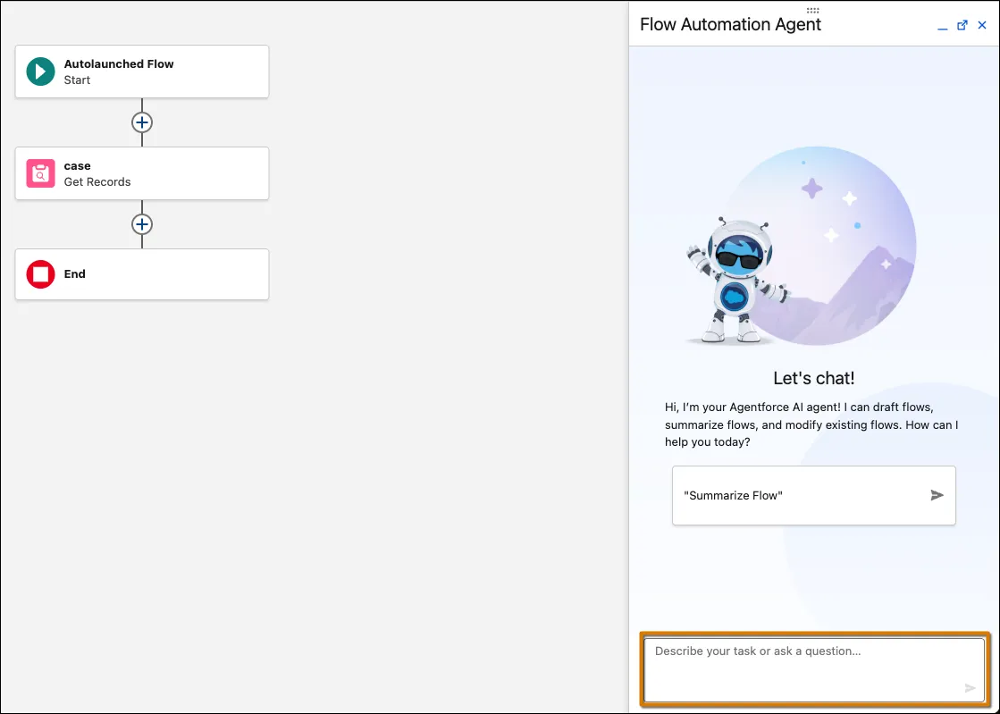
Changes generated by the Agent are presented for your approval before being applied—a human-in-the-loop design. Another welcome detail: this feature doesn't consume Generative AI Credits.
Usage Tab and Action Hub
The Automation App has a new Usage sub-tab showing bidirectional Flow dependencies: what sub-flows and resources it depends on, and which Flows, Agents, and Prompt Templates reference it. Before modifying a frequently-referenced Flow, check the Usage tab to avoid unintended downstream breakage.
Action Hub (Beta) provides a global view tracking Invocable Action usage across Flow Builder, Agentforce Builder, and Prompt Builder, with direct navigation to referencing locations.
Upgrade Checklist
If your org is planning to adopt these features, here's a quick readiness check:
| Feature | Prerequisites | Caveats |
|---|---|---|
| Screen Styling | None | Color values don't support variables; label styling not overridable |
| Editable Data Table | API v66 | Picklist and relationship fields not yet editable |
| Flow Logs | Data 360 enabled | Consumes Data 360 Credits—enable selectively |
| Kanban Board | None (Beta) | Read-only, no drag-and-drop |
| Content Document Trigger | None | Mind the distinction between Content Document and Content Version |
| Request Approval Component | Autolaunched Flow with required variables | Requires firstApprover and submissionComments variables |
| Agentforce for Flow | User self-enables the panel | No Gen AI Credit consumption |